@style23 takes the spotlight for this week’s featured trader as he shared his simple, but effective trade on $BTC!
As Leonardo Da Vinci says, “simplicity is the ultimate sophistication.” In trading, you don’t need the most complex tools, strategies, or equipment. All you need is a good understanding of the market’s behavior and the effort to plan out how you can navigate through the volatility.
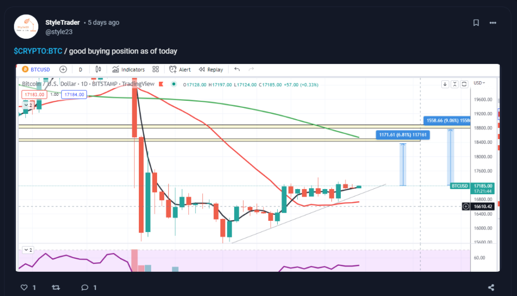
@style23 shared his swing trade idea on $BTC and where it might head using just a few charting tools.
Based on the analysis, it can be seen that prices were sitting on a confluence of supports. Whenever trendlines and moving averages go hand in hand, the support tends to be stronger. Resistances were also easy to spot since the longer-term moving average was also in confluence with the 18,400 price level. As volatility compressed, easy entries and exits could be found. For the entry, you can either buy on the breakout or at support. You’d also just need to cut your losses once prices move below the support area. Since the resistance can easily be spotted, that can already serve as your take profits area.
TECHNICALS OF THE TRADE
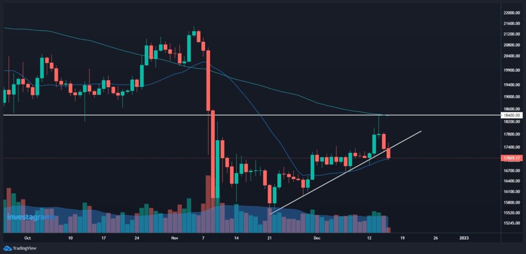
$BTC at the time was, and still, is in a downtrend. However, prices slowly crept upward as the crypto market stabilized. As the U.S. inflation reporting date drew nearer, Bitcoin prices started to consolidate in a tight range. When the data came out better than expected, prices quickly sprung up. Although a long-lasting uptrend didn’t develop, the opportunity to take a quick swing trade was still there.
Through @style23’s simple analysis, a 6.81% profit in just a few days!
FUNDAMENTALS OF THE TRADE
$BTC was mostly resilient as the 18,000 level held for a long time. However, most tokens came crashing down after controversies emerged. While many are still bullish on the long-term fundamentals of crypto, the bad news still made a dent as prices came crashing down.
WHAT SHOULD BE MY NEXT MOVE
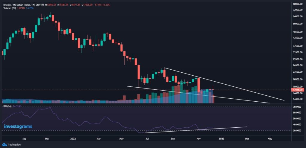
Right now, it doesn’t seem like $BTC will rally strongly anytime soon. Although a bullish divergence formed, it may be too early to expect a reversal of the major trend given the current macro situation and the price weakness shown when the 18,000 level was touched. Ideally, you should wait for the trendline resistance to break and hold first before using trend-following strategies. Until then, it’s best to keep trades short and simple.
Once again, KUDOS to @style23 for being this week’s featured trader! Enjoy your 14-day InvestaPrime Access and continue to be an inspiration to the trading community.
Got no time analyzing hundreds of stocks or cryptocurrencies one chart at a time? We’ll make it easier for you with our ProScreener!
Economic growth drivers are what boost a country’s production of goods and services. It is one of the most important propellers of prosperity in a country. It attracts more foreign investment, improves productivity, and lowers poverty.
With that said, the Philippine economy is considered one of the most dynamic economies in the East Asia Pacific region. Solid economic fundamentals and a competitive workforce drive the growth momentum of its economy.
The Philippine Economy
Economic Growth is often seen as a measure of progress, but from another perspective, it’s also a product that provides a better life for us. Economic growth serves as a stand-in for rising living standards, which go beyond tangibles like housing and encompass more intangible facets of daily life. For example, economic growth can lead to more jobs, improved education systems and health services, and reduced poverty rates.
Because of the country’s expanding industries, the Philippine economy is expanding. The most recent business leaders are growing their companies by researching markets and optimizing their strategies. To assist small business owners, financial institutions like banks and microfinance organizations have been expanding their services. These programs include lending and crowdfunding.
During the third quarter of 2022, the gross domestic product (GDP) of the Philippines amounted to approximately 5.24 trillion Philippine pesos. The country’s GDP reflected a 7.6 percent growth in that period, particularly due to growth in the construction industry. This rate is still expected to rise.
Why Should I Care About Economic Growth?
Countries gain the capability and resources necessary to provide the public goods and services that their population requires, such as healthcare, education, social protection, and basic public services when economies grow and states can levy taxes on that income.
Inclusive growth results in broader material gains in addition to those offered by the government. Wealth is produced by economic growth, some of which directly benefits companies and workers by raising their standard of living. People can escape poverty and achieve higher living standards when their incomes rise and they spend more money.
Drivers of Economic Growth
Land Supply
Land stimulates economic growth. It has great potential to increase productivity and provide a lot of benefits to an economy. Any modification to how land is used would have an impact on how agriculture, forestry, tourism, and construction operate.
Commercial real estate can be divided into land, buildings, and occupancy leases. When not used by business owners and entrepreneurs, the land is largely useless. Up until the population increases or when the factors driving economic growth change, commercial real estate is stable.
Natural resources that originate from the earth are also used by producers and fall under this category. These sources consist of:
Labor is an economic growth driver because it allows companies to meet the demand for their products. The labor force is measured by looking at the percentage of the working-age population that has a job or educational experience that enables them to be self-employed, specializing in certain fields. In other words, manpower refers to the economical amount of workers needed for different endeavors and related industries. Organizations must hire a larger pool of workers who are educated enough to benefit from innovations as a result of the constant flow of technology that is improving productivity.
As an investor, you can identify investment opportunities in companies that are improving their factors of production.
Capital
Capital goods are also important economic growth drivers. They can be described as items of infrastructure – for example, roads, bridges, and railways that are used to produce either consumer products or intermediate goods for other industries. Capital is an economic growth driver because it’s the basic tool a business needs to produce something of value. Equipment, computers, trucks, factories, and all sorts of other capital items are important components for production. Economic growth happens when more capital becomes available for investment in new items that create value for society.
Entrepreneurship
Entrepreneurship is an important contributor to economic growth, especially in developing countries. It can lead to increases in income and wealth, higher productivity, better health, and education, as well as being a way for people to participate in democracy and create value on the global stage. Entrepreneurs are the drivers of employment and goods and services innovation throughout the economy.
The success of entrepreneurs depends entirely on the development of a business plan. This is a document that business owners use to outline the operations, goals, and objectives of their organization. Entrepreneurs should look for resources, hire staff, and access financing once the business plan has been created.
Last Words
Now that you have learned about economic growth factors, we hope you learned something new. You know now that the private sector is just a part of the total economy and its role in driving growth. If you ever want to go beyond the basics of economics and explore how government policy impacts our global economy.
By learning more about economic growth drivers you will be able to better understand why countries hold respect for their economic strengths. Moreover, you will understand the factors that affect it and how faster economic growth can raise people’s standard of living.
Got no time analyzing hundreds of stocks or cryptocurrencies one chart at a time? We’ll make it easier for you with our ProScreener!
In a quote by Arian Adeli Koodehi, he says “A successful trader must learn to be a good loser before he can start winning.” Losing in the market is part of the journey in becoming a successful trader. From your losses, learn where you went wrong and make sure not to do it again. Create strategies that will guide you in trading, and most importantly, continue to learn more each day.
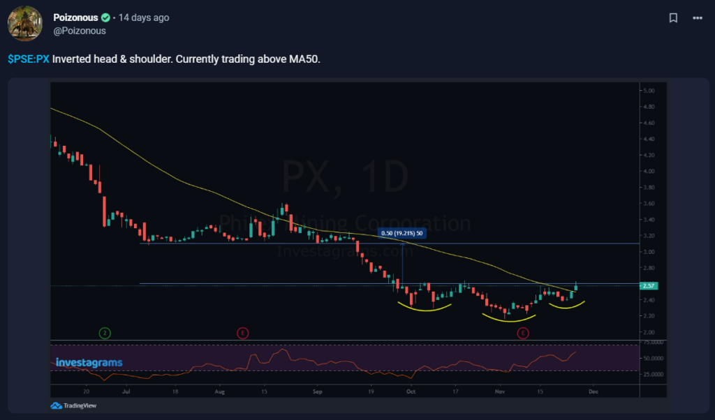
@Poizonous takes the spotlight for this week’s featured trader as he shares his knowledge with us on the PSEI market! Let’s take a look at how @Poizonous uses this to his advantage.
@Poizonous shared his thoughts on $PX and its potential course of action by utilizing technical analysis.
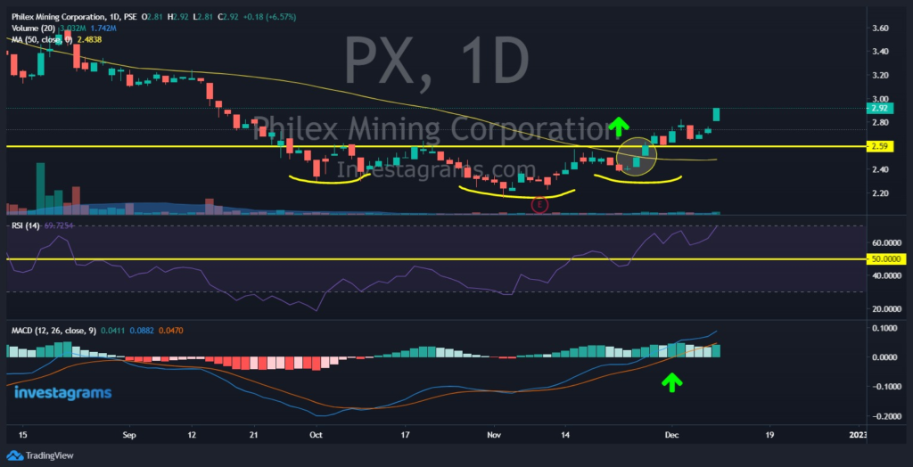
Let’s take a look at @Poizonous view on $PX. As we can see, he plotted out a moving average indicator which is used to help smooth out price data by creating a constantly updated average price. In this case, it is a MA50, meaning it takes data from the last 50 days. Next we can see an RSI, a momentum indicator, which tells us whether or not a stock is overbought (above 90) or oversold (below 30). Additionally, a chart pattern known as a “Head & Shoulders Pattern,” which is said to represent a bullish-to-bearish trend reversal and indicate that an upward trend is about to come to an end, is shown. It is regarded by investors as one of the most accurate patterns for trend reversals.
TECHNICALS OF THE TRADE
Technically, $PX at the time was trading in an uptrend. It has just recently gone above MA50, indicating that it had potential to push its price even higher. Moreover, we can see that the MACD showed no signs of reversing. The RSI was above 50, but not over 90, indicating that it still had more potential to push its price right up. Lastly, take note of the inverted head and shoulder pattern which was spotted by @Poizonous. This indicator signals that the stock is headed towards a bullish direction.
Through the analysis of @Poizonous, a successful trade was made, earning him around 8-10% in profits!
FUNDAMENTALS OF THE TRADE
Due to lower copper prices and metal output, Philex Mining Corp.’s core earnings fell by 17% to P1.54 billion from January to September of this year, compared to P1.86 billion during the same period last year.
According to disclosure made to the Philippine Stock Exchange (PSE) , Philex’s net income decreased by 12.9% to P1.64 billion over the course of the first nine months of this year from P1.88 billion the previous year.
WHAT SHOULD BE MY NEXT MOVE
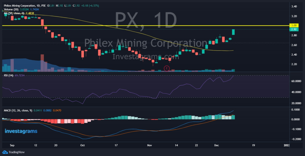
Looking at the current state of $PX, it is advisable not to buy yet, but instead wait for price to drop. As of today, the price of $PX is closing in into the PHP3 resistance meaning that it could start going down from there. Additionally, the RSI has touched 90 levels, indicating that it is overbought and holders might sell their positions any time soon.
It’s best to wait for a pullback or buy during the PHP3 breakout. If you are holding $PX right now, selling even a quarter of your position would be a good choice in order to protect gains.
With all the data gathered, it is best to plan your trades in advance by keeping up with the latest $PX news and market demand for minerals. Make use of both fundamental analysis and technical analysis. By exercising diligence, you can develop into a profitable trader!
Once again, KUDOS to @Poizonous for being this week’s featured trader! Enjoy your 14-day InvestaPrime Access and continue to be an inspiration to the trading community.
Clueless on how to invest in the stock market?
The stock Market can be a frightening world to step into, but in reality, investing isn’t as hard or complex as it might seem. With Prime+ Research, we want to do our part to provide you with the right mindset and strategy to be profitable in the market.
Let us guide you to start your investing journey today!
Leverage is a form of an operational facility provided to an investor by a broker that enables traders to take positions larger than the required amount of capital. By just paying down a portion of the total position value, the investor’s market exposure is increased. In other words, using leverage in trading entails using funds through a form of credit.
How does leverage work?
Let’s say a trader decides they need more money to trade while having PHP10,000 in their account. They might then decide to use the leverage that a broker offers. They could have invested PHP100,000 if they opted to apply a 1:10 leverage (10,000 X 10). The broker will essentially lend you the remaining funds to enable you to start the position after taking a specific amount as margin, which varies depending on the type of financial instrument.
Getting into detail about the Concept of Leverage
Let’s assume that your trading account has PHP10,000 in it. You choose to invest this amount in shares at a cost of PHP50. As the price rises during the day, you once more close the bet when it reaches PHP60. Let’s now analyze what would happen if we trade with and without leverage.
Without using it, the price has increased by PHP10, and 100 shares would cost PHP5000. The value of these 100 shares has increased by PHP10. In this scenario, your overall profit is PHP6,000 or 20%.
Now, let’s say that you choose to apply a 1:10 leverage to your investment. Currently, shares cost PHP100,000 to purchase. A trade on 1000 shares is available. The value of these shares has increased by PHP10. In this scenario, your overall profit is PHP10,000 or 200%.
As you can see, applying leverage would allow you to benefit more in this situation. However, keep in mind that the same thing may have occurred in the other direction. When using leverage, your loss would have been greater if the price had dropped.
Advantages and Disadvantages
Leverage allows traders to join and handle larger money with a little margin, which is a benefit. This is enticing to many traders, but it’s crucial to keep in mind that it can have a double-edged effect by amplifying both gains and losses. You can use the remaining free margin for subsequent trades because you only need to set aside a small amount of your total available balance for one position.
Leverage can boost your earnings, but it can also multiply your losses. Therefore, it’s essential to handle leverage responsibly and consider the possible consequences of a losing trade. Furthermore, your trade may be put into “Margin Call” if you don’t have enough money in your account to cover a potential loss. If this occurs, your broker can close your holdings to reduce the risk for both of you.
How do I minimize my Risk with Leverage Trading?
Although using leverage can result in substantial returns, it’s wise to remember that there is always a chance of losing money. Having a strong risk management strategy in place, such as defining the maximum percentage of your account balance you wish to risk per trade, is one way to limit risk.
To limit the greatest amount you can lose on a deal, use stop-loss orders. However, keep in mind that stop-loss orders are not guaranteed, and you can encounter some slippage during periods of low liquidity.
By using a trading plan and keeping a trading record, you can keep your emotions in check. Trading using leverage can be alluring because it gives traders the ability to control a much larger stake than they would otherwise have.
Now You Know!
It’s important to monitor and manage one’s position continually. An investor must first determine whether the cost of debt is less than the potential return before acquiring a leveraged position. If an investor doesn’t have enough capital to cover any potential losses, they shouldn’t ever acquire a leveraged position.
Lastly, it is advisable to refrain from employing excessive leverage while first learning to trade. Leverage should only be used once you have a firm grasp of how to profit from trading. You can greatly boost your revenues if you use this effective tool correctly.
Clueless on how to invest in the stock market?
The stock Market can be a frightening world to step into, but in reality, investing isn’t as hard or complex as it might seem. With Prime+ Research, we want to do our part to provide you with the right mindset and strategy to be profitable in the market.
Let us guide you to start your investing journey today
@nicolepanlilio takes the spotlight for this week’s featured trader as he shares his knowledge with us on crypto! Let’s take a look at how @nicolepanlilio uses this to his advantage.
In a quote by Marty Schwartz, he says “My attitude is that I always want to be better prepared than someone I’m competing against. The way I prepare myself is by doing my work each night.” When trading in the market, the best thing you can do is be prepared! Don’t get all too confident thinking that trading is a no brainer. Plan your trades ahead of time and get that buck!
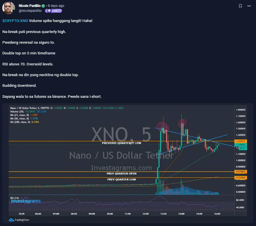
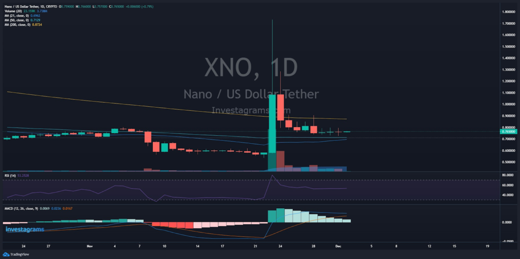
@nicolepanlilio shared his thoughts on $XNO and the potential course it might go by utilizing technical analysis.
Let’s take a look at @nicolepanlilio’s analysis on $XNO. First of all, he took notice of the volume which spiked at the 5 minute time frame. Volume usually indicates whether or not a coin is liquid. The higher the volume, the more liquid it is. He also took note of the double top pattern. This pattern usually signals a trend reversal, meaning that price is most likely to go down. Next is the RSI, a momentum indicator, which tells us whether or not a coin is overbought or oversold. And lastly, support and resistance lines which show specific price points on a chart that are expected to attract the maximum amount of either buying or selling.
TECHNICALS OF THE TRADE
Technically, $XNO at the time was trading at a downtrend. First we can observe that it was retesting resistance lines before plummeting back down in the 5 minute timeframe. We can also see that it’s trading below MA 21, indicating signs that it’s heading towards a down trend. As for the RSI, it is around the 50 levels meaning that there are neither more or less buyers/sellers in the market. Trading volume is substantially low considering the fact that it has recently been on a rally.
Through the analysis of @nicolepanlilio, a successful trade was made, earning him profits in the long run.
FUNDAMENTALS OF THE TRADE
In order to bring automated microtransactions to the language localization sector, The Nano Foundation and FynCom have joined forces.
Their pilot project, which aims to translate The Beginner’s Guide to Cryptocurrency and Nano into French, Spanish, Portuguese, German, and Dutch, has officially begun today. As part of the project, translators and approvers will receive nano rewards instantly and automatically for each word they translate.
WHAT SHOULD BE MY NEXT MOVE
Looking at the current state of $XNO, it would be wise to wait until price touches MA support levels. It seems to be ranging with little volume after the huge price spike in the last couple days. Be advised that it could be very risky to trade $XNO at this point since anything can happen. Add some positions on support, and start adding up again once it breaks resistance.
Additionally, take note as well of the price of $BTC as most coins rely on its price.
With all the information gathered, it is best to plan your trades ahead of time by listening to recent news on $BTC as well as your chosen coin. Don’t rely only on technical analysis alone, but fundamentals too. Practice due diligence and that way, you’ll be able to become a successful trader.
Once again, KUDOS to @nicolepanlilio for being this week’s featured trader! Enjoy your 14-day InvestaPrime Access and continue to be an inspiration to the trading community.
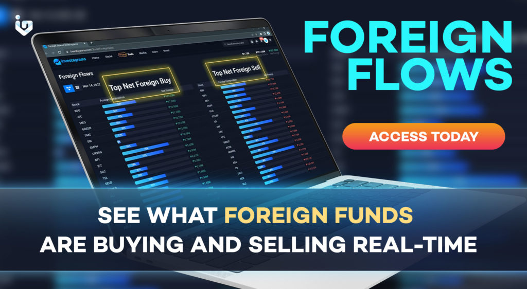
TRACK FOREIGN FLOWS ON INVESTAGRAMS
We have a new update coming your way, InvestaPrime Elite subscribers!
A long time request we’ve been getting is for you guys to be able to$ track the positioning of the foreign funds in the local market. With our newest feature you can now:
See what foreign funds are buying and selling
See the foreign funds composition in stocks you’re monitoring
One of the greatest marketplaces in the world is the foreign exchange market, or forex market. It is a worldwide decentralized or over-the-counter market where currencies are traded. When venturing into the Forex market, it is best to learn the basic forex terms. These forex terms should be kept in mind to help you not get confused during trading. There is a lot to learn about forex terms, so below are some of the basic terminologies to help you get started.
Currency Pair
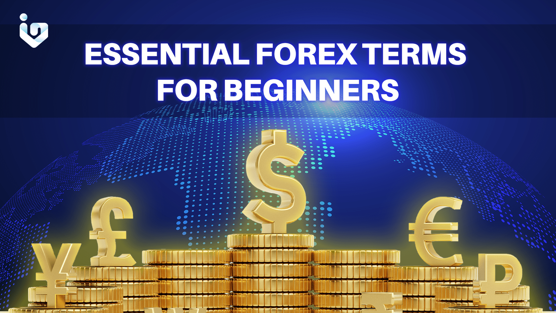
A price quote between two distinct currencies is referred to as a currency pair in the foreign exchange market. A currency pair’s first listed currency is referred to as the base, while the second listed currency—which serves as the benchmark—is known as the quote.
Base Currency
The first currency in a forex pair quotation is referred to as the base currency. One currency will always be quoted in relation to another on the foreign exchange market because you are buying one while selling the other.
The second currency, also referred to as the quote or counter currency, will appear after the base currency.
Let’s have a PHP/USD pair as an example. The base currency is the peso and the quote currency is the US dollar. If the price of the PHP/USD pair is 0.87, it means that you would need $0.87 to buy a single peso.
Quote Currency
Quote currency is the second currency included in a forex pair. This forex term also goes by the name of the counter currency.
The cost of buying one unit of the base currency by selling the quote currency is reflected in the price of a forex pair.
USD is the quote currency in the pair PHP/USD.
Exchange rate
An exchange rate determines the price at which one currency will be exchanged for another and has an impact on international trade and money transfers. In the Philippines, the exchange rate is typically stated as the peso equivalent of one US dollar. For instance, P59 Equals $1 US.
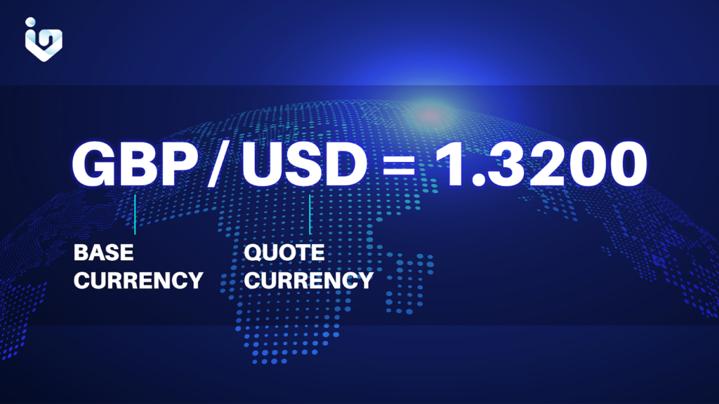
Ask Price
The price displayed on the right side of a quote is the ask price, which is also referred to as the offer price. This is the cost at which the base currency can be purchased. The offer price, as seen from the market maker’s perspective, is the price at which they are prepared to sell the underlying.
The bid price is marginally lower than the market price, whereas the offer price is marginally higher.
Bid Price
Bid Price is the cost at which a currency pair can be sold. This forex term, as seen from the market maker’s perspective, is the cost at which they are prepared to purchase the underlying asset from the trader.
While the offer price will always be marginally higher than the market price, the bid price will always be marginally lower.
Spread
The Spread is known as the difference in pips between the ask price and the bid price. Transaction fees are replaced by the spread, which stands in for brokerage service expenses.
Appreciation
Appreciation is an increase in the value of an exchange rate. For a variety of factors, including governmental policy, interest rates, trade balances, and business cycles, currencies appreciate against one another.
Depreciation
Depreciation is the decrease in the value of an exchange rate. Political unrest, interest rate differences, weak economic fundamentals, and investor risk aversion are a few examples of the causes of currency depreciation.
Gapping
A price that opens much higher or lower than the previous day’s close without any trading taking place in between. This forex term implies that a limit or stop order may be filled at a price other than the one at which it was placed.
Pips
The smallest price change that a currency exchange rate can make is called a pip, which stands for “percentage in point.” This forex term measures how much a currency pair’s exchange rate has changed in the forex market. Pips are the units used to measure market gains and losses.
Lot
Forex is typically traded in lots. The base currency is divided by 100,000 to get the size of a typical lot. It is frequently impractical to trade just one unit of a given asset or security due to its actual worth. In these situations, traders will utilize lots, which are predetermined quantities of a specific item that are bought or sold in each transaction. An “odd lot” is one where the position size differs from the standard lot size.
Equity refers to the entire amount of money, including your profit and loss, that is in your trading account. Your equity would be PHP 70,000, for instance, if you invested PHP 50,000 into your account and you also made a PHP 20,000 profit.
Margin
Margin is the minimum deposit needed to maintain an open position. This forex term is a security deposit that the broker maintains while a forex trade is open rather than a transaction fee.
Used Margin
It is the sum of money set aside by your broker to ensure that you don’t wind up with a negative balance and may continue to trade in your open positions.
Free Margin
Free Margin is the amount of money in your trading account with which you can open new trading positions. You must deduct the margin from your open positions from your equity in order to calculate free margin.
Margin Call
When a trader receives a notification that the capital in their account is insufficient to maintain an open position, it is known as a “margin call.” This forex term may force the trader to exit positions to lower the required maintenance margin or provide additional funds to balance the account.
Stop loss
The term “stop loss” isn’t just solely a forex term; it’s also widely used among traders of all markets. A stop loss order is a risk management technique that enables the closing of a position once it reaches a certain predetermined price. If prices continue to move in the investor’s negative direction, this helps guard against more losses on an open investment. Please be aware that, due to slippage, placing a standard stop loss order does not ensure that you will be filled at that specific market price.
Take profit
Same with “stop loss,” this forex term is also used by traders from various markets. As a risk management tool, a take profit order enables a position to be automatically closed after it achieves a certain predetermined profit target. This can guard against losing money if the price suddenly changes direction before the investor can close the bet.
Profit/Loss
The amount of money received from realized (closed) trade positions after a transaction.
Now You’re All Set!
It seems like there’s a lot, right? Well you don’t need to worry about it, because once you’ve familiarized yourself with these terms, it’ll just get easier.
We hope that you’ve learned forex terms, and remember, don’t stop learning new things! There’s more terms to learn along the way and more familiarizing needs to be done. Keep that grind up and you’ll be a successful trader in no time!
TRACK FOREIGN FLOWS ON INVESTAGRAMS
We have a new update coming your way, InvestaPrime Elite subscribers!
A long time request we’ve been getting is for you guys to be able to track the positioning of the foreign funds in the local market. With our newest feature you can now:
See what foreign funds are buying and selling
See the foreign funds composition in stocks you’re monitoring
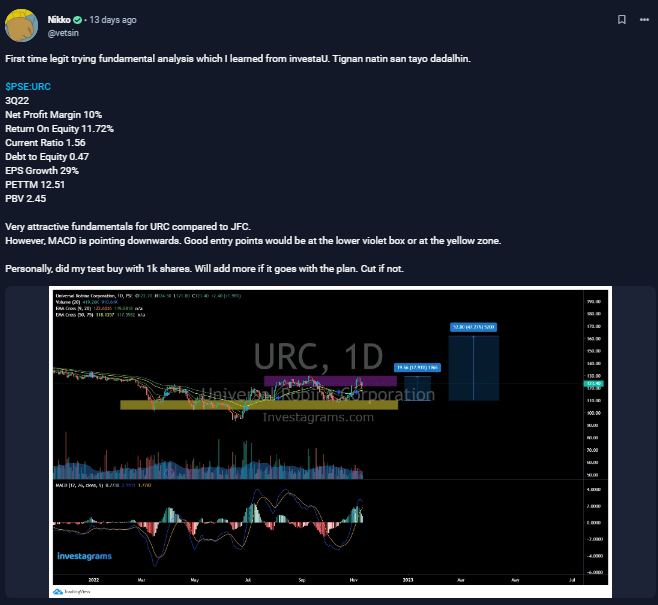
In a quote by Warren Buffet, he says “Risk comes from not knowing what you’re doing.” As a trader, one of the things you need to be worried about is not having enough knowledge to make a successful trade. Yes, some may be lucky, but luck may run out. Knowledge is everything when it comes to trading, and that’s what @vetsin did.
@vetsin takes the spotlight for this week’s featured trader as he shares his knowledge with us on stocks from the PSEI by utilizing fundamental analysis with the help of Investa University. Let’s take a look at how @vetsin uses this to his advantage.
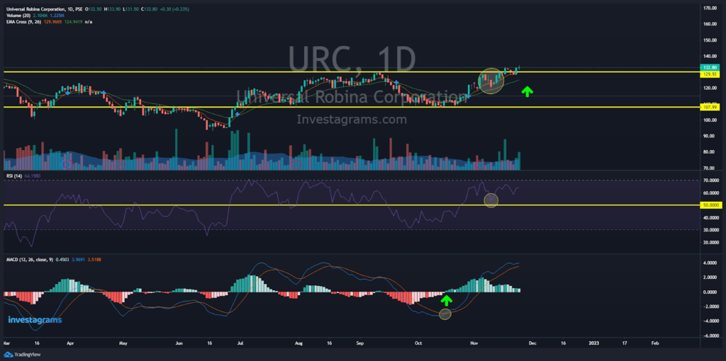
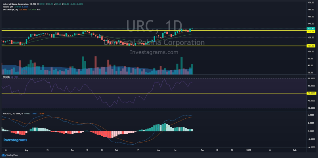
Let’s take a look at @vetsin’s analysis on $URC. One of the notable things he pointed out was the stock’s fundamental analysis. Because most of the data provided were positive, it convinced him enough to say that the stock price was bound to go higher. Moving on, we can see that he has plotted out support and resistance lines which helps identify points of demand and trends. The EMA cross, a trend indicator, was also used to help identify the average price based on recent data. Moreover, the MACD, a trend indicator, was also spotted which helped show the relationship between two exponential moving averages (EMAs) of a stock’s price.
TECHNICALS OF THE TRADE
Technically, $URC at the time was trading at a range. Looking at the EMA, it is seen the price has touched support, indicating that it may bounce back up. Moreover, we can see the RSI is still around the 50-60 levels. This usually means that the stock price still has enough potential to go even higher. Lastly, we can see that the MACD has crossed. When this happens, the trend switches from negative to positive. This allows $URC’s price to push even higher.
Through the analysis of @vetsin, a successful trade was made, earning him profits in the long run.
FUNDAMENTALS OF THE TRADE
URC, or Universal Robina Corp., reported a net income of P9.72 billion for the nine months of the year ending September 30, a 13% decrease from P11.23 billion in 2021 because of a gain in asset sales recorded the previous year. Operating income growth was matched by a 9 percent increase in core net income, which excludes one-time gains.
WHAT SHOULD BE MY NEXT MOVE
Looking at the current state of $URC, we can notice a few things that could either plummet or skyrocket in price. First, we can see that it has broken out from the resistance of PHP130. This means that the possibility of the price going higher is most likely to happen. Next, the RSI is not at its overbought levels, indicating that it still has more potential to increase. However, looking at the MACD, we can see signs of reversal. This could cause prices to either go in a range or head downwards (considering the other indicators).
Given this, it is preferable to test buy this stock and not go all in. Try investing a few shares from time to time and buy only at support lines or possible breakouts. Moreover, increase your knowledge by heading over to Investa University to learn more about what to do and what not to do in trading.
Once again, KUDOS to @vetsin for being this week’s featured trader! Enjoy your 14-day InvestaPrime Access and continue to be an inspiration to the trading community.
Subscribe to our Newsletter
Join our mailing list for investing tips and stock market advice to help you reach your first million.